About this app
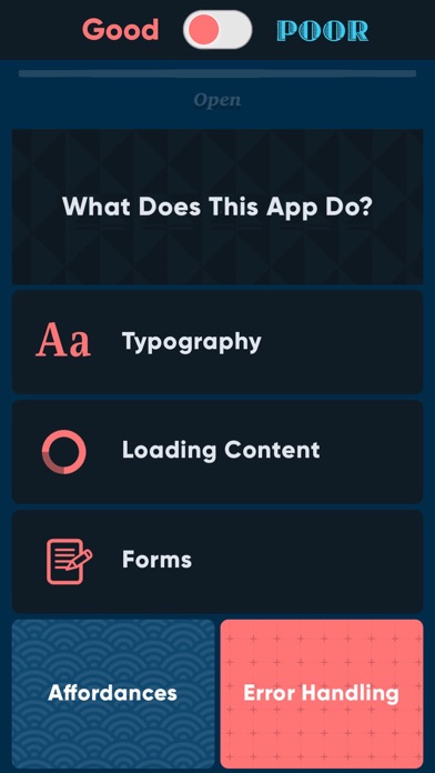
Have you ever wondered if user experience design really matters that much? This app illustrates how two digital experiences can meet the same set of requirements—on paper—yet deliver wildly different results. Check out some extreme examples of good vs. poor design and development practices. We hope you find it educational or at the very least, amusing. :-)
Latest release
What’s New
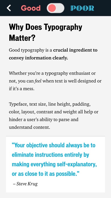
Oh boy... were you one of the people who was using Dark Mode and wondered why in the world an UX demo app would use white text over a light gray background? We've updated the app to no longer invert the body text color when one uses Dark Mode. If you like it better now, we'd be tremendously grateful if you can adjust your rating accordingly. Thank you!
Audience growth
Ratings growth
Baseline captured. Growth appears after the crawler observes a changed rating count.
Momentum comes from crawler snapshots for the tracked storefront. “Viral growth signal” means unusually fast recent rating gains; it is an indicator, not download data.
Price tracking
Price intelligence
First snapshot captured. The trend line starts after the next crawler price observation.
- First observed Sep 2, 2026 · 12:14 PM Free
Screenshots